Unit Type in Dev Studio AlphaApp Platform
The Unit Type is one of the Element Properties in Dev Studio Alphatech Technology app builder which defines the user interface element you want to use on the app screen. They can differ according to the kind of screen you need on each page, so be sure to choose the right kind of element.
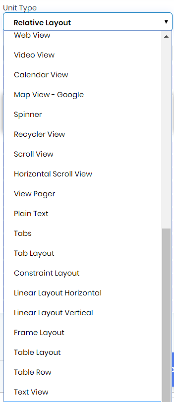
See below the Unit Types predefined in Alphatech Technology app builder and what each of them represents:
- Screen type - Short Description
- Plain Text - A user interface element for entering and modifying text (input). Plain text can contain alpha-numeric characters.
- MultiLine Text - A user interface element for entering and modifying text (input/textarea). MultiLine Text can contain multiple lines of alpha-numeric characters.
- Password - A user interface element for entering and modifying text (input). Password field can accept a secret word.
- Password Numeric - A user interface element for entering and modifying text (input). Password field can accept a secret number.
- Email - A user interface element for entering and modifying text (input). Email field accepts an email.
- Phone - A user interface element for entering and modifying text (input). Phone field accepts a phone number.
- Time - A user interface element for entering and modifying text (input). Time field selects the time of the day.
- Date - A user interface element for entering and modifying text (input). Date field selects the date.
- Number - A user interface element for entering and modifying text (input). Number field can contain numbers.
- Number Signed - A user interface element for entering and modifying text (input). Number signed field can contain a number that is signed, allowing a positive or negative sign at the start.
- Number Decimal - A user interface element for entering and modifying text (input). Number decimal field can contain a number that is decimal, allowing a decimal point to provide fractional values.
- Auto Complete - A user interface element for entering and modifying text (input). For the auto-complete field the text editor (which means the application) is performing auto-completion of the text being entered based on its own semantics, which it will present to the user as they type.
- Button - A user interface element the user can tap or click to perform an action.
- Image Button - Displays a button with an image (instead of text) that can be pressed or clicked by the user.
- CheckBox - Checkboxes allow the user to select one or more options from a set.
- Radio Group - This unit is used to create a set of radio buttons.
- Radio Button - Radio buttons allow the user to select one option from a set.
- Toggle Button - A toggle button allows the user to change a setting between two states. (example on/off)
- Switch Button - A toggle button allows the user to change a setting between two states. (example on/off)
- Floating Button - A floating action button is a circular button that triggers the primary action in your app's UI.
- Image View - Displays image resources, for example Bitmap or Drawable resources.
- Web View - A View that displays web pages.
- Video View - Displays a video file.
- Calendar View - A calendar widget for displaying and selecting dates.
- Map View - Google - A View which displays a map (with data obtained from the Google Maps service).
- Spinner - Spinners provide a quick way to select one value from a set. (a select field)
- Recycler View - Displays a scrolling list of elements based on large data sets.
- Scroll View - A view group that allows the view hierarchy placed within it to be scrolled.
- Horizontal Scroll View - A view group that allows the view hierarchy placed within it to be scrolled horizontally.
- View Pager - Layout manager that allows the user to flip left and right through pages of data.
- Tabs Tabs - organize content across different screens, data sets, and other interactions.
- Tab Layout - TabLayout provides a horizontal layout to display tabs.
- Constraint Layout - A View which allows you to position and size widgets in a flexible way.
- Linear Layout Horizontal - A layout that arranges other views horizontally in a single column.
- Linear Layout Vertical - A layout that arranges other views vertically in a single row.
- Frame Layout - FrameLayout is designed to block out an area on the screen to display a single item.
- Table Layout - A layout that arranges its children into rows and columns.
- Table Row - A layout that arranges its children horizontally. A TableRow should always be used as a child of a TableLayout.
- Text View - A user interface element that displays text to the user.
- Relative Layout - RelativeLayout is a view group that displays child views in relative positions.
- List View - Displays a vertically-scrollable collection of views, where each view is positioned immediately below the previous view in the list.